Taking place from 1964-1965, the most recent season of Mad Men, now on dvd and bluray, was a turning point for the look of the show: new Sterling Cooper Draper Pryce offices and a new downtown apartment for Don. Dan Bishop won the Art Director’s Guild award for Best Single Camera TV Series for the fourth time in a row for the premiere season 4 episode, Public Relations. Let’s take a look at the two largest new sets that were unveiled in season 4.
Sterling Cooper Draper Pryce


The use of primary colours within the new SCDP buildings signals the youthful turn the design in ’64 was taking. Compare these colours to the colour scheme at Sterling Cooper – SCDP is brighter and more vibrant, mirroring the revitalization of lifeblood of the company – they might have more trouble getting the large clients than they used to, but employees like Peggy and Joey are keeping the company more in tune with what’s hip.
 In Roger’s office, designed by his younger wife Jane, we see fantastic mod prints in the style of Bridget Riley. You can read more about those as well as the David Weidman prints in Peggy’s office in this LA Times article.

Speaking of Peggy’s office, it’s much pinker than the old office of Freddy Rumsen’s that she was using at Sterling Cooper.

I always love getting a peek at the ads posted on the walls at SCDP – what an art department dream! It’s the details like this that show how fantastic the Mad Men team really is.
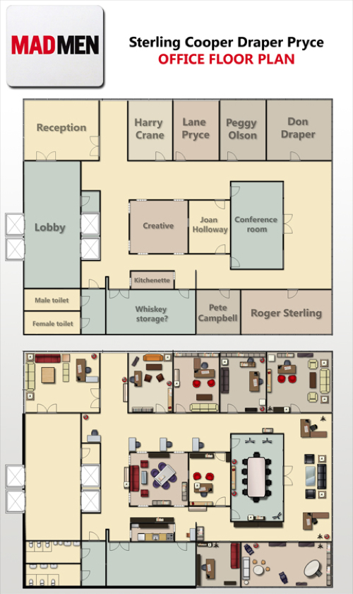
Here’s a fan-made floor plan of the new SCDP offices – note the lack of a large “bullpen” full of secretaries like in the old Sterling Cooper offices. The photo below shows the new, downsized secretarial pool.

Don’s Apartment


More neutral colours are used, in contrast with the lighter pastels used in the Draper home, like the blue in their foyer or the yellow in Don and Betty’s bedroom. Dark greens make the apartment feel more masculine.


Even scenes with Don outside of the apartment use the same colour palette, giving Don’s single life an overall feeling of drabness.

Don’s windows looking out onto the city constantly remind the viewer that we aren’t in idyllic suburbia anymore.
One more set from this season that I love: the child psychologist’s office. Get a load of those curtains!

.
What do you think of the new Sterling Cooper Draper Pryce offices? Don’s apartment? What other sets from season 4 deserve a shout out?
.
Alison.
.